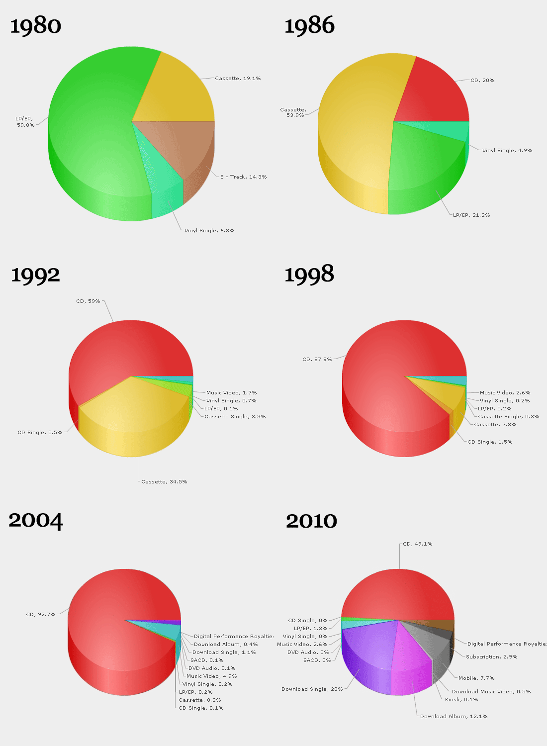
AN ANIMATED .GIF OF THE MUSIC INDUSTRY’S DEATH

Charts are a dime a dozen and often don’t tell you much you already didn’t know. But every now and then one comes along that really puts things into perspective. This animated .gif shows the sales of various formats of music by year. You can see the shift from the LP era to tape cassettes to CD and so on and so forth. The narrative here is of course very familiar already, but it’s the way it’s presented that makes the difference. Commentary from Fastcodesign.com:
… somehow, just the simple fact of stringing all these pie charts together tells you about the nature of music-format innovation. Here, the industry’s change appears inevitable, and the only surprising thing about it is how long the CD enjoyed a period of utter and total dominance. The CD ruled for far longer than most formats — and with extremely high margins, due to cheap production costs — but it was always doomed to be overturned.
Put another way: If you were a music executive sitting in a presentation 10 years ago and you’d been presented this chart, would you have any doubt that your CD business was going to die? Moreover, wouldn’t you have seen that in a historical context, the invention of the CD was an effervescent bit of luck? This ugly, animated gif carries a force that you can’t summon in a static line chart.
You can’t look at this chart without thinking, “What next?” This chart doesn’t take into account that the very idea that all people need to own music to consume it is quickly becoming outdated. MP3s as a dominant format have been around for a decade now (more if you start counting years when Napster first emerged), so perhaps the next shift is right around the corner: all-you-can-eat streaming services like Spotify, MOG, Rdio. If you’re a record exec right now, do you see it coming? Whether you see it or not… it’s definitely coming.
-VN
Thanks: Justin Reich

